Bon Voyage
Planning travel with traditional resources can be difficult, frustrating, and leave out a lot of local flair. This app works to help strategic travelers easily explore, book, and discover unique locations all in one place.
*This was my first project ever and it has been left intentionally raw! I love it because you get a taste of my instincts and starting place.
The problem 🧐
Burned by poor travel and booking experiences before, the structured creative needs a curated and socially interactive way to plan travel that is:
Affordable and tailored to their preferences
Comfortable and accounts for safety
Full of experiences to “live like a local”
The solution 🥳
Create a mobile app that allows users to expertly research, plan, and execute their vacations in a way that makes them feel confident and safe in their travels.
Insights💡
What was the biggest problem?
There are so many travel options on the market that do certain things well, but local flair and customization are the top priority for this traveller.
What were some extra considerations?
Budgeting and value for experiences
The tremendous depth in planning of schedules and itineraries


Direction 🗺
This was guided by the users wishes and disruption to the market. A huge burden came to emphasizing local flair as the distinguishing factor and make the experience “braggable” (aka to incite FOMO in all of their friends who didn’t tag along). This drew me to focus on the unique details that would make this travel experience truly different and more grandiose.
Research Artifacts 🔬
Eric
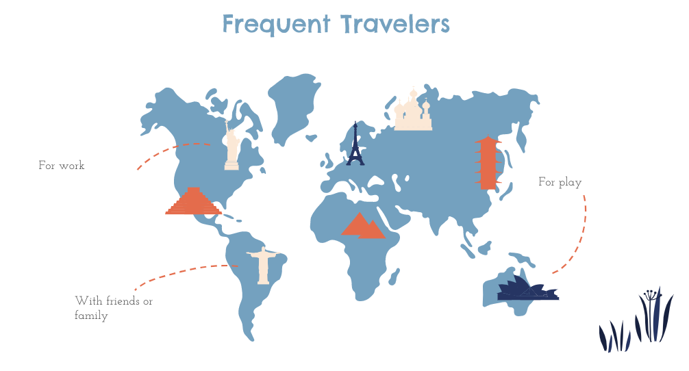
Eric is constantly traveling, planning a trip, or daydreaming about it. He’s very mindful of how much he can spend on these grand excursions, but makes the time and effort to know they’ll be great. He has a high set of expectations and has been let down in the past with mediocre trips impacted by poor planning, falling for tourist traps. He wants to make sure his trips match his online aesthetic. How can he be expect people to lust after his travels if they are all using the same, played-out sites to research and book experiences? He needs something new and notable.
Style Tile
A palette full of rich teals, mid-toned oranges, and pops of pink encourage a light, happy, and carefree experience. The emphasis is placed on fun and excitement, while never overbearing with too many bright colors to seem juvenile or untrustworthy. This makes a distinct splash versus the color schemes and logos of other competitors (Trip Advisor, Airbnb, Culture Trip). Easy, bright, and joyful to plan colorful trips.
MVP 🤝
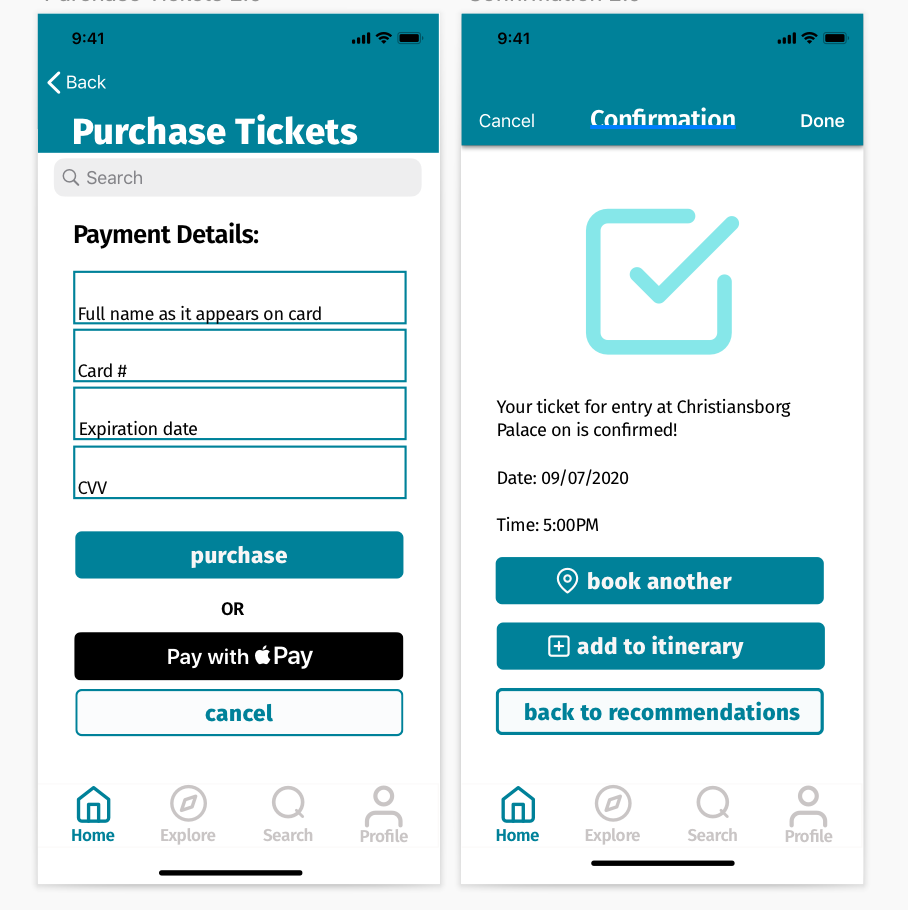
This is the high fidelity prototype that was tested by folks who fit the persona as closely as possible. It is not perfect, but I’m really proud of showcasing my first try to compare to where the rest of my projects were.
Validation ✨
““Easy to use and I like that everything is streamlined in one place instead of being routed to other websites””
— Templeton, frequent traveler and adventurer
“I liked that there were not an excess of options and everything was well-located”
— Hayley, travel industry professional
Next Steps ➡️
Increase User Trust
Heavy feedback surrounded small ways to increase user trust. Since travel is anxiety-inducing, users want to know they can rely on the app in ways such as:
email confirmation post purchase
downloading tickets/plans
Budget Page Redesign
I will likely always say this, but research is the core of UX and one of the aspects I enjoy the most. The budget page is one I would spend more time exploring and testing. There are many ways to showcase this and since this was a high concern for users it is high on the list to get right.
Clarity
There was confusion around some of the icons and labels used. Revisiting this to make the experience more clear overall. The clearer the product, the better (for users and profitability).


